Correlation analysis
Defination
Correlation coefficient is a quantity that measures the strength of the association (or dependence) between two or more variables.
Types of correlation coefficient
-
Pearson r: is a
parametric correlation testas it depends on the distribution (normal distribution) of the data. It measures the linear dependence between two variables. The plot of y = f(x) is named the linear regression curve. (the mostly used method) -
Kendall tau: rank-based correlation coefficient (non-parametric methods). Recommended if the data do not come from a bivariate normal distribution.
-
Spearman rho: rank-base correlation coefficient (non-parametric methods). Recommended if the data do not come from a bivariate normal distribution.
Correlation formula
In the formula below,
$x$ and $y$ are two vectors of length $n$
$m_y$ and $m_y$ corresponds to the means of $x$ and $y$, respectively.
Pearson correlation formula
The p-value (significance level) of the correlation can be determined :
- by using the correlation coefficient table for the degrees of freedom : $df=n-2$, where $n$ is the number of observation in x and y variables.
- or by calculating the t value as follow: In the case 2) the corresponding p-value is determined using t distribution table for $df=n-2$
If the p-value is < 5%, then the correlation between x and y is significant.
Spearman correlation formula
The Spearman correlation method computes the correlation between the rank of $x$ and the rank of $y$ variables.
Where $x’ = rank(x_)$ and $y’ = rank(y_)$.
Kendall correlation formula
The Kendall correlation method measures the correspondence between the ranking of x and y variables. The total number of possible pairings of x with y observations is $n(n???1)/2$, where n is the size of x and y.
The procedure is as follow:
Begin by ordering the pairs by the x values. If x and y are correlated, then they would have the same relative rank orders.
Now, for each $y_i$, count the number of $y_j > y_i$ (concordant pairs (c)) and the number of $y_j < y_i$ (discordant pairs (d)).
Kendall correlation distance is defined as follow:
Where, $n_c$: total number of concordant pairs $n_d$: total number of discordant pairs $n$: size of x and y
Calculate correlation coefficient
Correlation coefficient can be computed using the functions cor() or cor.test():
cor(x, y, method = c("pearson", "kendall", "spearman"), use = "complete.obs")
cor.test(x, y, method=c("pearson", "kendall", "spearman"), use = "complete.obs")

x and y are two numeric vectors with the same length
cor() computes the correlation coefficient
cor.test() test for association/correlation between paired samples. It returns both the correlation coefficient and the significance level(or p-value) of the correlation.
use = "complete.obs" handle missing values by case-wise deletion
Preleminary test to check the test assumptions
data are normally distributed
-
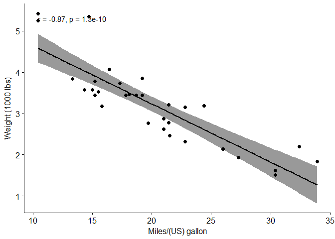
Is the covariation linear? Yes, form the plot, the relationship is linear. In the situation where the scatter plots show curved patterns, we are dealing with nonlinear association between the two variables.
-
Are the data from each of the 2 variables (x, y) follow a normal distribution?
- Use Shapiro-Wilk normality test -> R function:
shapiro.test()and look at the normality plot -> R function:ggpubr::ggqqplot() - Shapiro-Wilk test can be performed as follow:
- Null hypothesis: the data are normally distributed
- Alternative hypothesis: the data are not normally distributed
- Use Shapiro-Wilk normality test -> R function:
library(ggpubr)
## Loading required package: ggplot2
## Loading required package: magrittr
ggscatter(mtcars, x = "mpg", y = "wt",
          add = "reg.line",
          conf.int = TRUE,
          cor.coef = TRUE,
          cor.method = "pearson",
          xlab = "Miles/(US) gallon",
          ylab = "Weight (1000 lbs)")
#Shapiro-Wilk normality test for mpg and wt
shapiro.test(mtcars$mpg)
##
## 	Shapiro-Wilk normality test
##
## data:  mtcars$mpg
## W = 0.94756, p-value = 0.1229
shapiro.test(mtcars$wt)
##
## 	Shapiro-Wilk normality test
##
## data:  mtcars$wt
## W = 0.94326, p-value = 0.09265
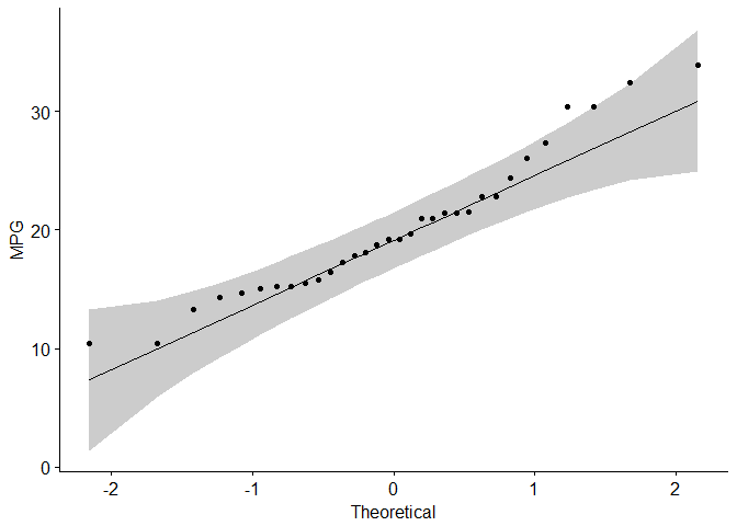
#Visual inspection of the data normality using Q-Q plots (quantile-quantile plots)
#Q-Q plot draws the correlation between a given sample and the normal distribution.
ggqqplot(mtcars$mpg, ylab = "MPG")
ggqqplot(mtcars$wt, ylab = "WT")

#Pearson correlation test
cor.test(mtcars$wt, mtcars$mpg, method = "pearson")
##
## 	Pearson's product-moment correlation
##
## data:  mtcars$wt and mtcars$mpg
## t = -9.559, df = 30, p-value = 1.294e-10
## alternative hypothesis: true correlation is not equal to 0
## 95 percent confidence interval:
##  -0.9338264 -0.7440872
## sample estimates:
##        cor
## -0.8676594
data are not normally distributed
If the data are not normally distributed, it’s recommended to use the non-parametric correlation, including Spearman and Kendall rank-based correlation tests.
#Spearman rank correlation coefficient
cor.test(mtcars$wt, mtcars$mpg,  method = "spearman")
## Warning in cor.test.default(mtcars$wt, mtcars$mpg, method = "spearman"):
## Cannot compute exact p-value with ties
##
## 	Spearman's rank correlation rho
##
## data:  mtcars$wt and mtcars$mpg
## S = 10292, p-value = 1.488e-11
## alternative hypothesis: true rho is not equal to 0
## sample estimates:
##       rho
## -0.886422
#Kendall rank correlation test
res <- cor.test(mtcars$wt, mtcars$mpg,  method="kendall")
## Warning in cor.test.default(mtcars$wt, mtcars$mpg, method = "kendall"):
## Cannot compute exact p-value with ties
#Extract the p.value and the correlation coefficient
res$p.value
## [1] 6.70577e-09
res$estimate
##        tau
## -0.7278321
Interprete correlation coefficient
The value of correlation coefficient can be negative or positive, range [-1, 1]:
- -1: strong negative correlation
- 0: no relationship between the two variables (x and y)
- 1: strong positive correlation
Generate correlation matrix
Function rcorr from Hmisc package used to return correlation coefficients and the correlation p-values, function ggcorrplot from ggcorrplot used to visualize correlation matrix.
Method one: calculate matrix manually
Method two: function ggcorr() in ggally package. However, can’t reorder matrix and display significance level.
Method three: corrplot() function from corrplot package can be used
Method four: ggcorrplot() function from ggcorrplot package. Functions: reordering, displays significance level, computing a matrix of correlation p-values.
#install.packages("corrplot")
library(corrplot)

#install.packages("Hmisc")
library(Hmisc)
#install.packages("ggcorrplot")
library(ggcorrplot)
Compute correlation matrix
Method one: use ggcorrplot()
cor() return correlation matrix; cor_pmat() in ggcorrplot package computes a matrix of correlation p-values.
corr <- round(cor(mtcars), 2) #Compute a correlation matrix
p.mat <- cor_pmat(mtcars) #Compute a matrix of correlation p-values
Method two: use rcorr()
The function rcorr() [in Hmisc package] returns both the correlation coefficients and the correlation p-values for all possible pairs of columns in the data table.
rcorr(x, type = c("pearson","spearman"))

The output is a list containing the following elements:
r: the correlation matrix
n: the matrix of the number of observations used in analyzing each pair of variables
P: the p-values corresponding to the significance levels of correlations.
#corr <- rcorr(as.matrix(mtcars))
#head(round(corr$r, 2)) #Extract the correlation coefficients
#head(round(corr$P, 3)) #Extract p-values
Method three: use cor()
cor() can be used to compute a correlation matrix, but not correlation p-values
cor(x, method = c("pearson", "kendall", "spearman"), use = "complete.obs")
x: numeric matrix or a data frame.
method: indicates the correlation coefficient to be computed.
  - pearson(default): measures the linear dependence between two variables.
  - kendall: non-parametric rank-based correlation test.
  - spearman: non-parametric rank-based correlation test.
use = "complete.obs": case-wise deletion, which is useful for NA-containing matrix.
Computing the p-value of correlations
P value calculation principle
# mat : is a matrix of data
# ... : further arguments to pass to the native R cor.test function
cor.mtest <- function(mat, ...) {
    mat <- as.matrix(mat)
    n <- ncol(mat)
    p.mat<- matrix(NA, n, n)
    diag(p.mat) <- 0
    for (i in 1:(n - 1)) {
        for (j in (i + 1):n) {
            tmp <- cor.test(mat[, i], mat[, j], ...)
            p.mat[i, j] <- p.mat[j, i] <- tmp$p.value
        }
    }
  colnames(p.mat) <- rownames(p.mat) <- colnames(mat)
  p.mat
}

#matrix of the p-value of the correlation
p.mat <- cor.mtest(mtcars)
Format the correlation matrix (unnecessary)
### flattenCorrMatrix function
#cormat: matrix of the correlation coefficients
#pmat: matrix of the correlation p-values
flattenCorrMatrix <- function(cormat, pmat) {
  ut <- upper.tri(cormat)
  data.frame(
    row = rownames(cormat)[row(cormat)[ut]],
    column = rownames(cormat)[col(cormat)[ut]],
    cor  =(cormat)[ut],
    p = pmat[ut]
    )
}

#head(flattenCorrMatrix(corr$r, corr$P))
Visualize correlation matrix
Five different ways to visualize a correlation matrix:
- symnum() function (gave up, too lazy to introduce)
- corrplot() function to plot a correlogram
- scatter plots
- heatmap
- ggcorrplot function (recommend)
corrplot() function to plot a correlogram
R corrplot function is used to plot the graph of the correlation matrix.
corrplot(corr, method="circle", type="upper", order="hclust", col=col, bg="lightblue", tl.col="black", tl.srt=45, )

corr:	The correlation matrix to visualize. To visualize a general matrix, please use is.corr=FALSE.
method:	seven visualization method: "circle", "square"", "ellipse", number", "shade"", "color", "pie"
type: types of layout.
  - "full" (default): display full correlation matrix
  - "upper": display upper triangular of the correlation matrix
  - "lower": display lower triangular of the correlation matrix
order: reorder the correlation matrix. The correlation matrix can be reordered according to the correlation coefficient. This is important to identify the hidden structure and pattern in the matrix.
  - "hclust": for hierarchical clustering order
tl.col: for text label color, used to change text colors
tl.srt: for text label string rotation. used to change label rotations.
library(RColorBrewer)
col<- colorRampPalette(c("red", "white", "blue"))(20)

corrplot(corr,
         method="circle", #visualization method
         type="upper", #types of layout
         order="hclust", #order: reorder the correlation matrix
         col=col, #col: Using different color spectrum
         #bg="lightblue", #bg: Change background color to lightblue
         #col=brewer.pal(n=8, name="RdBu") #use RcolorBrewer palette of colors
         #col=brewer.pal(n=8, name="RdYlBu") #use RcolorBrewer palette of colors
         #col=brewer.pal(n=8, name="PuOr") #use RcolorBrewer palette of colors
         tl.col="blue", #change text colors
         tl.srt=45, #change label rotations

         #Combine with significance
         p.mat = p.mat, #add the matrix of p-value
         sig.level = 0.01, ## Specialized the insignificant value according to the significant level
         insig = "blank", #Leave blank on no significant coefficient

         diag=FALSE #hide correlation coefficient on the principal diagonal
         )
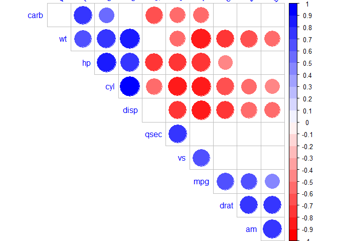
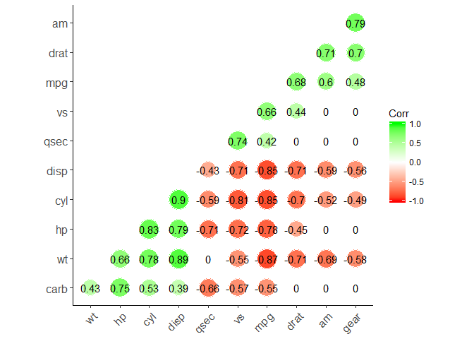
chart.Correlation(): Draw scatter plots
chart.Correlation() in package PerformanceAnalytics can be used to display a chart of a correlation matrix.
#install.packages("PerformanceAnalytics")
library("PerformanceAnalytics")
my_data <- mtcars[, c(1,3,4,5,6,7)]
chart.Correlation(my_data, histogram=TRUE, pch=19)
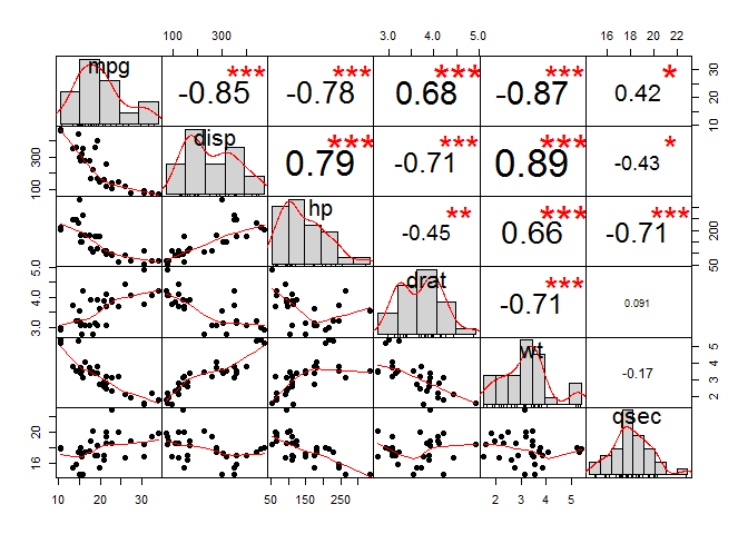
#The distribution of each variable is shown on the diagonal.
#left bottom of the diagonal: the bivariate scatter plots with a fitted line are displayed
#right top of the diagonal: the value of the correlation plus the significance level as stars
#Each significance level is associated to a symbol:
#p-values(0, 0.001, 0.01, 0.05, 0.1, 1) <=> symbols(***, **, *, ., ,"")
Use heatmap()
col <- colorRampPalette(c("blue", "white", "red"))(20)
heatmap(x = corr, col = col, symm = TRUE)
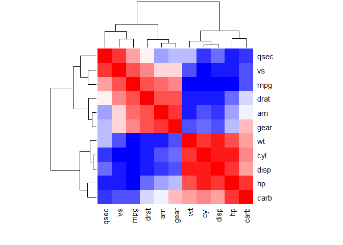
#x: the correlation matrix to be plotted
#col: color palettes
#symm: logical indicating if x should be treated symmetrically; can only be true when x is a square matrix.
ggcorrplot function (recommend)
ggcorrplot(corr,
           method = "circle",  #"square" (default), "circle"
           type = "lower", # "full" (default), "lower" or "upper" display.
           hc.order = TRUE, #logical value. If TRUE, correlation matrix will be hc.ordered using hclust function.
           outline.col = "white", #the outline color of square or circle. Default "gray"
           ggtheme = ggplot2::theme_classic, #Change theme
           colors = c("red", "white", "green"), #Change colors
           lab = TRUE, #Add correlation coefficients
           sig.level=0.05, #set significant level
           p.mat = p.mat, #Add correlation significance level
           insig = "blank" #Leave blank on no significant coefficient
           )
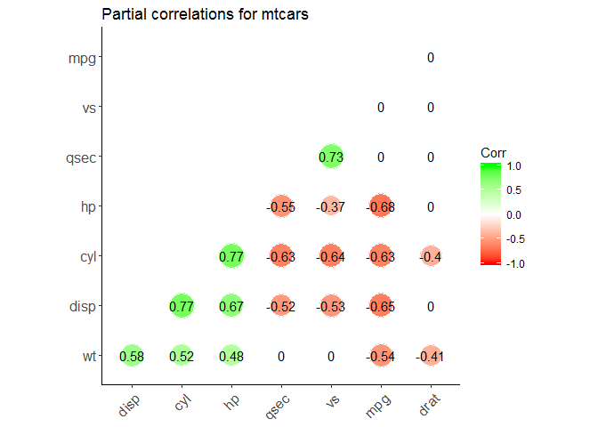
Partial correlation
The R package ppcor provides users with four functions: pcor(), pcor.test(), spcor(), and spcor.test().
pcor() calculates the partial correlations of all pairs of two random variables of a matrix or a data frame and provides the matrices of statistics and p-values of each pairwise partial correlation.
pcor.test() computes the pairwise partial correlation coefficient of a pair of two random variables given one or more random variables.
# install.packages("ppcor")
library(ppcor)
# calculate the correlations between each pair with all other variables are adjusted
partial.corr <- pcor(x=mtcars, method="spearman")
#Results interpretation: ?pcor()

# calculate the correlations between each pair with specified variables are adjusted
partial_correlation <- function(df) {
  n <- ncol(df)
  results <- list() # define an empty list
  results[["estimate"]] <- sapply(1:(n-3), function(x) {
    sapply(1:(n-3), function(y) {
      ifelse(x == y, 1, pcor.test(df[,x], df[,y], df[,c((n-2):n)], method="spearman")$estimate)
    })
  })
  results[["p.value"]] <- sapply(1:(n-3), function(x) {
    sapply(1:(n-3), function(y) {
      ifelse(x == y, 0, pcor.test(df[,x], df[,y], df[,c((n-2):n)], method="spearman")$p.value)
    })
  })
  colnames(results[["estimate"]]) <- rownames(results[["estimate"]]) <- colnames(df[, c(1:(n-3))])
  colnames(results[["p.value"]]) <- rownames(results[["p.value"]]) <- colnames(df[, c(1:(n-3))])
  return(results)
}

pcor <- partial_correlation(mtcars)

library(ggcorrplot)
ggcorrplot(pcor$estimate,
           method = "circle",  #"square" (default), "circle"
           type = "lower", # "full" (default), "lower" or "upper" display.
           hc.order = TRUE, #logical value. If TRUE, correlation matrix will be hc.ordered using hclust function.
           outline.col = "white", #the outline color of square or circle. Default "gray"
           ggtheme = ggplot2::theme_classic, #Change theme
           colors = c("red", "white", "green"), #Change colors
           lab = TRUE, #Add correlation coefficients
           sig.level=0.05, #set significant level
           p.mat = pcor$p.value, #Add correlation significance level
           insig = "blank", #Leave blank on no significant coefficient
           title = "Partial correlations for mtcars"
           )
References
Correlation Test Between Two Variables in R
correlation formula
Correlation coefficient
Correlation coefficient calculator
Correlation matrix online software: Analysis and visualization
Elegant correlation table using xtable R package
Correlation matrix : An R function to do all you need
Correlation matrix: analyze, format and visualize
ggplot2: Quick correlation matrix heatmap
corrplot: Visualize correlation matrix
ggcorrplot: Visualization of a correlation matrix using ggplot2
ppcor
stackoverflow