Volcano plot
volcano plot introduction
火山图(Volcano Plot)是一类用来展示组间差异数据的图像,因为在生物体发生变化时从全局角度而言大部分的基因表达没有或着发生了很小程度的变化,只有少部分基因的表达发生了显著的变化。故而,火山图常见于RNA表达谱和芯片的数据分析中,最常用于分析基因的差异表达,近年来也陆续有其他组学的应用。
火山图的本质是一个Plus版的散点图,其中包含两个重要的概念:
- 显著性,也就是p-value,差异性检验两组样本的p值,以负对数-log10(P-value)转换做为纵坐标;
- 以log2(Fold Change)为横坐标,即可得火山图,利用一定的筛选条件(如Fold Change大于2倍,显著性P值小于0.05),即可筛选出显著差异表达的基因,进行后续研究。
Preparation
# load package
suppressPackageStartupMessages(library(ggplot2))
suppressPackageStartupMessages(library(ggrepel)) #Avoid overlapping labels
suppressPackageStartupMessages(library(dplyr))

# load data
genes <- read.table("https://gist.githubusercontent.com/stephenturner/806e31fce55a8b7175af/raw/1a507c4c3f9f1baaa3a69187223ff3d3050628d4/results.txt", header = TRUE)
head(genes)
##      Gene log2FoldChange    pvalue      padj
## 1    DOK6         0.5100 1.861e-08 0.0003053
## 2    TBX5        -2.1290 5.655e-08 0.0004191
## 3 SLC32A1         0.9003 7.664e-08 0.0004191
## 4  IFITM1        -1.6870 3.735e-06 0.0068090
## 5   NUP93         0.3659 3.373e-06 0.0068090
## 6 EMILIN2         1.5340 2.976e-06 0.0068090
Data preprocessing
# categorize genes that have absolute log2 fold change > 1 and p-adjusted-value < Bonferroni cut-off (usually 0.05)
# label both absolute log2 fold change > 2 and p-adjusted-value < 0.05 as "both"
# labels onl p-adjusted-value < 0.05 as "significant"
# label only absolute log2 fold change > 2 as "log2FC > 1"
genes$labels <- ifelse(abs(genes$log2FoldChange) > 1 & genes$padj < 0.05, "Both",
                       ifelse(genes$padj < 0.05, "Significant",
                              ifelse(abs(genes$log2FoldChange) > 1, "log2FC > 1", "None")))
count(genes, labels)
## # A tibble: 4 x 2
##        labels     n
##         <chr> <int>
## 1        Both    17
## 2  log2FC > 1    93
## 3        None 16291
## 4 Significant     5
Volcano plots
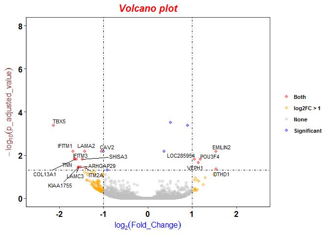
p <- ggplot(genes, aes(log2FoldChange, -1*log10(padj)))
p <- p + geom_point(aes(color=labels), alpha=0.4, size=1.75) # draw the basic structure of volcano plot

# add text for dots with abs(log2FC) > 1 and padj < 0.05
# to avoid the overlaps between text, we use geom_text_repel to separate them
p <- p + geom_text_repel(data = subset(genes, labels == "Both"), aes(label = Gene), size = 3)

# change color by groups
# the order of the color is the alphabet order of label names
p <- p + scale_color_manual(values =c("red", "orange", "grey", "blue"))

# set a and y axis limits
p <- p + xlim(c(-2.5, 2.5)) + ylim(c(0, 8))

# add vertical and horizontal
p <- p + geom_vline(xintercept=c(-1,1), lty=4, col="black", lwd=0.6)
p <- p + geom_hline(yintercept = -log10(0.05), lty=4, col="black", lwd=0.6)

# add title and axis titles
p <- p + labs(title="Volcano plot", x=expression(log[2](Fold_Change)), y=expression(-log[10](p_adjusted_value)))

# set background
p <- p + theme_bw() + theme(panel.grid.major = element_blank(), panel.grid.minor = element_blank(), axis.line = element_line(colour = "black"))

# set plot theme
p <- p + theme(
          # Change the color, size and the face of main title, x and y axis labels
          plot.title = element_text(color="red", size=15, face="bold.italic", hjust = 0.5), #centered the title
          axis.title.x = element_text(color="blue", size=12, face="bold"),
          axis.title.y = element_text(color="#993333", size=12, face="italic"),
          # set legend
          legend.position="right",
          legend.title = element_blank(),
          legend.text= element_text(face="bold", color="black",family = "Times", size=8),
          # set axis tick
          axis.text.x = element_text(face="bold", color="black", size=12),
          axis.text.y = element_text(face="bold",  color="black", size=12))
p